

datatable
This block is part of the Component UI group and was last modified in core v12.0.3.
Storage Selection Required
This block relies on a storage to perform its storage releated actions. You must manually select the storage you want to use in your flow using the storage selector modal. To access the modal, click the white button on the block.
datatable v12.0.3 A complete data table including filters, sorting, and searchbar.
- Storage required
storageFrom which storage do you want the data to be loaded
- Columns required
fielddefinitionsChoose the columns you want to show
- Search Fields
fielddefinitionsFields that will be searched on in addition to the column fields
- Filters
datatablefilterChoose the filters you want to expose to the user • Hidden when other fields are filled
- Row Render
v10.4.46inpinfunctionAccepts a function that returns a row
- Query
queryQuery used as a base for the datatable
- rows per page
v10.3.13numberNumber of results per page in the table
- infinite scroll
v12.0.0conditionWill load new rows as soon as the last row is visible
- Hide controls
conditionHides the datatable controls (filters button, search bar, pagination).
- Hide Search Bar
conditionHides the datatable search bar. • Hidden when other fields are filled
- Show reload button
v10.5.2conditionIf set to true, the reload button will be shown on the top of the datatable • Hidden when other fields are filled
- Minimize filters
v10.4.54conditionBy default all filters will be visible, setting this to true will minimize the filters on datatable load. • Hidden when other fields are filled
- Hide custom filter
v10.6.2conditionIf set to true, the custom filter button will be hidden in the datatable • Hidden when other fields are filled
- Filter field search scope
v10.6.2scopeThe scope needed for searching through fields in datatable filters.
- Inline Edit
fielddefinitionsColumns that will be used for inline editing. Only basic text, number or date editing is allowed. For every advanced implementation an extra modal or page should be used.
- Inline Edit Scope
scopeThe scope needed for inline editing.
- Mass inline edit
fielddefinitionsAdds a button in the header, onclick will enable the inline edit for all the rows in that column
- Remove scope
scopeExact scope the user needs to match with to be able to remove items within this datatable. • Hidden when other fields are filled
- JSON scope
scopeScope the user needs to have to be able to view the JSON of a document, Admin is always allowed
- Revisions scope
scopeScope the user needs to have to be able to view the revisions of a document, Admin is always allowed
- Hide Checkbox
conditionIf set to true, the checkbox will be removed from the datatable
- Hide Remove
v10.4.28conditionIf set to true, the remove button will be removed from the datatable, even for admins
- Detail Button
inpinfunctionIf given, a detail button will show which runs the connected function on click.
- Edit Button
inpinfunctionIf given, an edit button will show which runs the connected function on click.
- Search Input Outlet
valueThis makes it possible to prefill an input with the search result or update it via the blueprints when searching in a datatable
- No results message
valueIf value given, it will show that message when no results are found
- On change
v10.4.51inpinfunctionFunction will execute every time the content of the datatable changes (on search or on filter).
- Show export
condition - Columns
fielddefinitionsChoose the columns you want to show in the export
- quotes
v12.0.3valueQuotes to use for the csv
- separator
v12.0.3valueDelimiter to use for the csv
- Export row render
inpinfunctionAccepts a function that returns a row. Only used for the export
- uicomponent
uicomponent
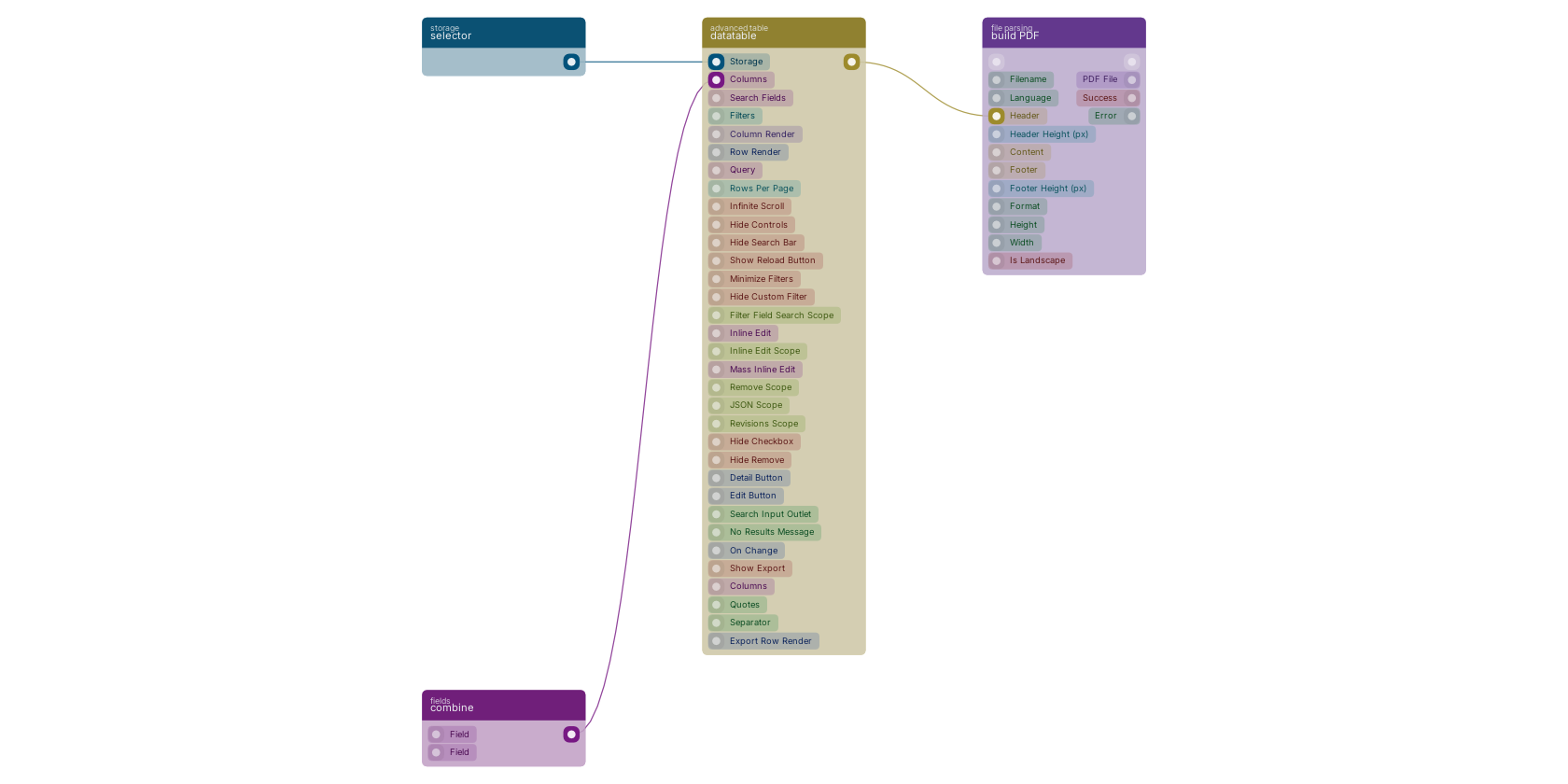
A typical wiring for datatable: selector feeds the co-storage pin; combine feeds the co-fields-columns pin; the uicomponent out pin feeds build PDF.
Version history
Introduced in v12.0.3.
v12.0.0, click here to see the release notes. v10.6.2 This block or one of its pins was updated in v10.6.2, click here to see the release notes. v10.5.2 This block or one of its pins was updated in v10.5.2, click here to see the release notes. v10.4.54 This block or one of its pins was updated in v10.4.54, click here to see the release notes. v10.4.51 This block or one of its pins was updated in v10.4.51, click here to see the release notes. v10.4.46 This block or one of its pins was updated in v10.4.46, click here to see the release notes. v10.4.28 This block or one of its pins was updated in v10.4.28, click here to see the release notes. v10.3.13 This block or one of its pins was updated in v10.3.13, click here to see the release notes. Back to
Component UI Return to the main group to view all sub-groups Back to advanced table Return to the group to view all blocks within this group